
A website should justify the investment — help sell and bring enquiries. For visitors to take the action you need (buy, request a quote, call), the page must guide them clearly. Design, structure, and copy work together.
In this article we focus on design elements that affect results. We also explain how to measure whether the site is doing its job — without marketing jargon.
How to tell if the site works
Effectiveness means the share of visitors who complete a useful action: purchase, sign-up, phone call, form submission.
The formula is simple: number of target actions divided by total visits. This shows whether the site earns its keep.
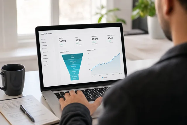
To track this, use analytics tools such as Google Analytics 4. Counters on the site and clear goals — visit duration, pages viewed, steps before an enquiry — show where people drop off. We often set this up as part of our analytics service.
The path from first glance to enquiry
Visitors move through stages: attention, interest, desire, action. You do not need to memorise the acronym — the logic is what matters.
First seconds — the headline, image, or layout must answer: “Am I in the right place?”
Next — the opening paragraph and your main offer. If the visitor does not think “this is what I was looking for”, they leave before reading further.
Then — benefits of your product or service, proof (reviews, portfolio), and reasons to trust you.
Finally — a clear call to action: buy, order, call, or send an enquiry.
After the purchase or enquiry, satisfaction matters too. A defective product or slow reply breaks trust even when the site did its job at first. Long-term effectiveness includes what happens after the click.
1. Your main offer on the homepage
Your unique offer is what sets you apart from competitors — the reason a client chooses you.
A strong homepage offer:
— speaks to your target audience;
— differs clearly from competitors;
— stays short and specific, with numbers where possible;
— highlights the main benefit for the visitor;
— feels honest, not exaggerated.
When someone opens your site, they should quickly understand:
— What can I find here that helps me?
— Why are you different from others?
If within seconds they see quality, service, guarantees, reviews, and fair terms — they are more likely to enquire or buy.
Avoid in the main offer:
— niche jargon visitors will not understand;
— naming competitors;
— undervaluing any profession or role;
— promises you cannot keep.
2. Design and first impression
Within the first seconds, a visitor decides whether the site feels trustworthy. Attractiveness comes from layout, colours, typography, and spacing.
What matters for visual perception:
— clean, modern look;
— simple, comfortable use on phone and desktop;
— clear structure — no guessing where to click;
— consistent style across pages.
To increase the chance of an enquiry, the site should feel calm and safe — not noisy or pushy.
Elements that often help hold attention:
— short video with a clear message about the product or service;
— thoughtful scrolling effects used sparingly, not on every block;
— visible calls to action — buttons that say exactly what happens next (“Get a quote”, “Book a call”);
— light animation on buttons or banners, used in moderation;
— readable copy and typography — fonts that match your brand without hurting legibility.
3. Visual emphasis
Bright details in the right places draw the eye. Choose accents based on what you want the visitor to notice.
Examples:
— an animated arrow toward a “Buy” or “Enquire” button;
— font sizes that highlight headings vs body text;
— colour contrast that guides attention without shouting;
— illustrations that support the message, not only decorate;
— 3D or product visuals where they clarify the offer;
— pop-ups used carefully — for a genuine offer or enquiry form, not on every page load.
The list is long; the rule is not to overdo it. Too many effects tire visitors and reduce trust.
4. Before and after comparisons
Side-by-side photos work well on service pages — for example beauty, renovation, or training — where the result is visual. They show outcome, not only words.
5. Limited-time offers
A countdown to the end of a promotion can motivate a faster decision — when the offer is real. Fake urgency damages trust.
6. Bonuses
An extra benefit helps nudge a decision: free consultation with a booking, gift with purchase. Use when it fits your business model — not as permanent noise on every page.
What drives visitors away
In summary, many design tools can improve results — but balance matters. An overloaded or aggressive page scares people off.
Visitors often leave because of:
— outdated or cluttered design;
— walls of text and tiny fonts;
— low-quality images;
— missing or confusing navigation;
— slow loading — see website speed optimisation;
— intrusive ads or pop-ups;
— poor search or no search at all.
How people feel about your site shapes how they feel about your product or service.
Related articles
— Corporate website — your business card
— Why you need a website brief
We help businesses improve site structure, design, and analytics. Message us in your preferred messenger or fill in the form. Share your ideas — we will suggest the best approach, calculate cost, and outline a timeline.